The Brand at a Glance
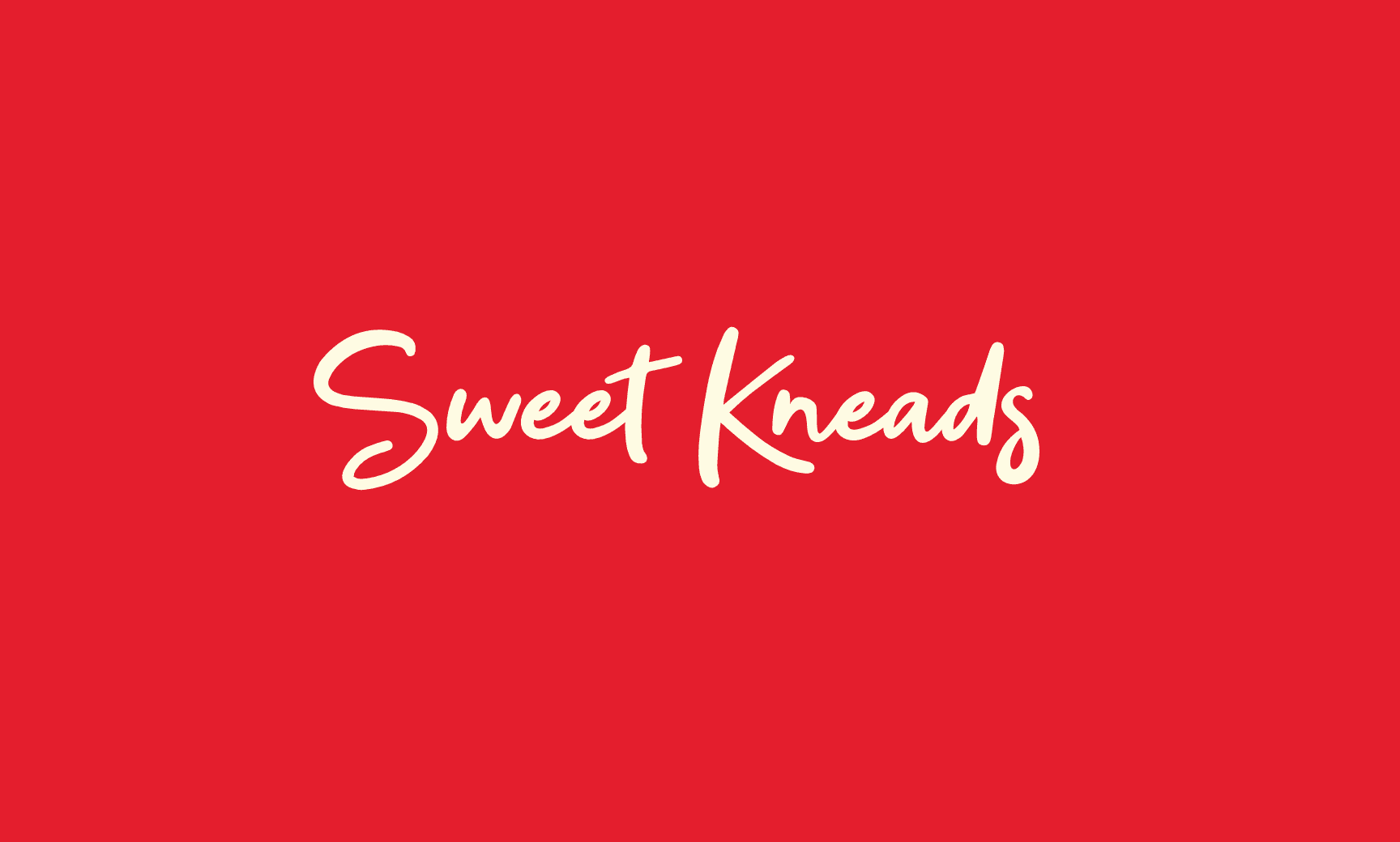
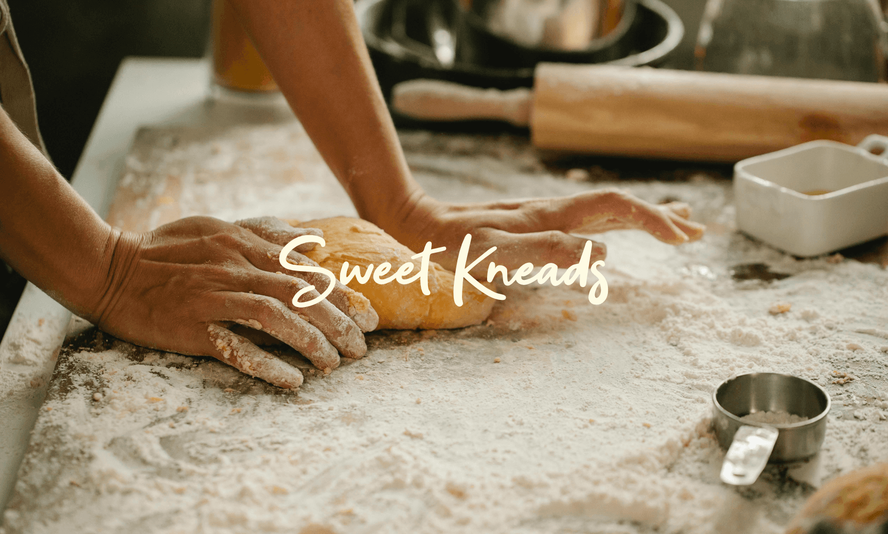
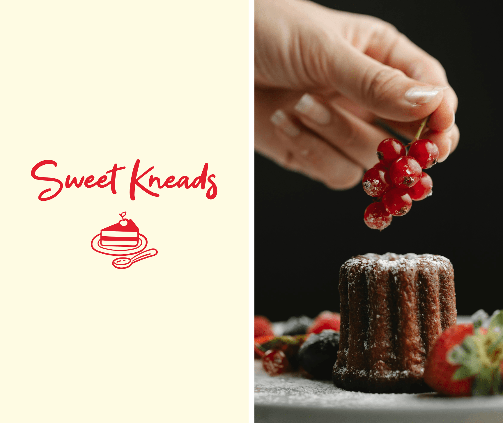
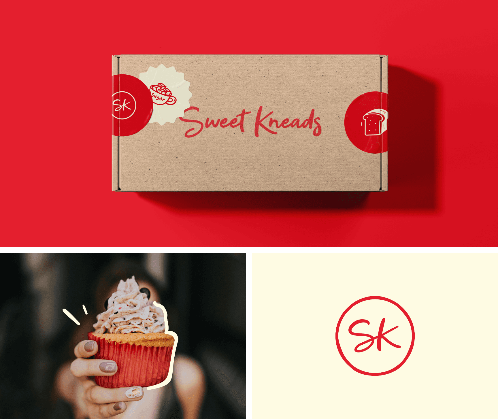
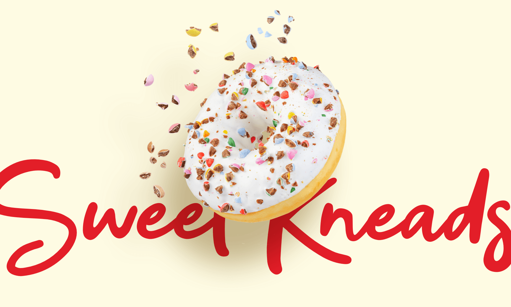
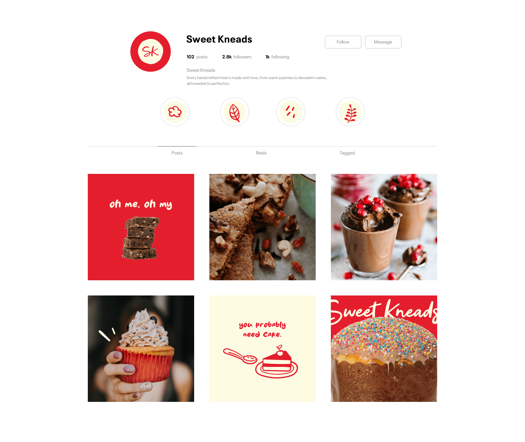
Sweet Kneads is a bakery brand that captures the warmth and whimsy of homemade treats. Its personality is lighthearted and nostalgic, inviting customers into a world of sugar, celebration, and flour-dusted joy.
Strategy and Design
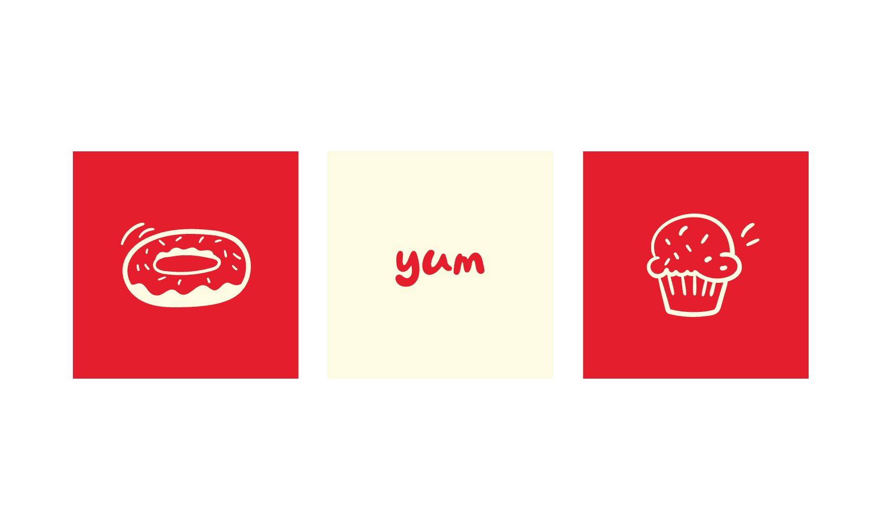
The brand strategy centered around playful imperfection. Baking is messy, emotional, and full of energy. The visual identity captures this through a hand-drawn script logo that mimics the spontaneity of piped icing. Custom icons of cupcakes, cherries, and donuts create a flexible system of visual cues that extend across packaging and signage. A bold red and cream color scheme injects warmth and brightness into every application. Strategic terms like whisk, sprinkle, and swoon defined the emotional tone of the design. Sweet Kneads avoids the overly rustic or overly minimal directions common in the space. It lands somewhere more human, where sweetness lives in the imperfection.
Click below to schedule a call.
GET STARTED