The Challenge
Glowry had a strong product, a beautiful ethos, and a growing following, but their brand felt too soft, too generic, and too quiet to stand out. They needed a look that could balance mystery with refinement and give the brand a more iconic presence.
The Strategy Sprint
Through collaborative strategy sessions, we clarified Glowry’s positioning as a brand that invites pause — a moment of stillness in a noisy world. We defined a voice that felt confident, poetic, and a little unexpected. The visual direction called for texture, mood, and contrast — something that would lean into the sensory nature of their product.
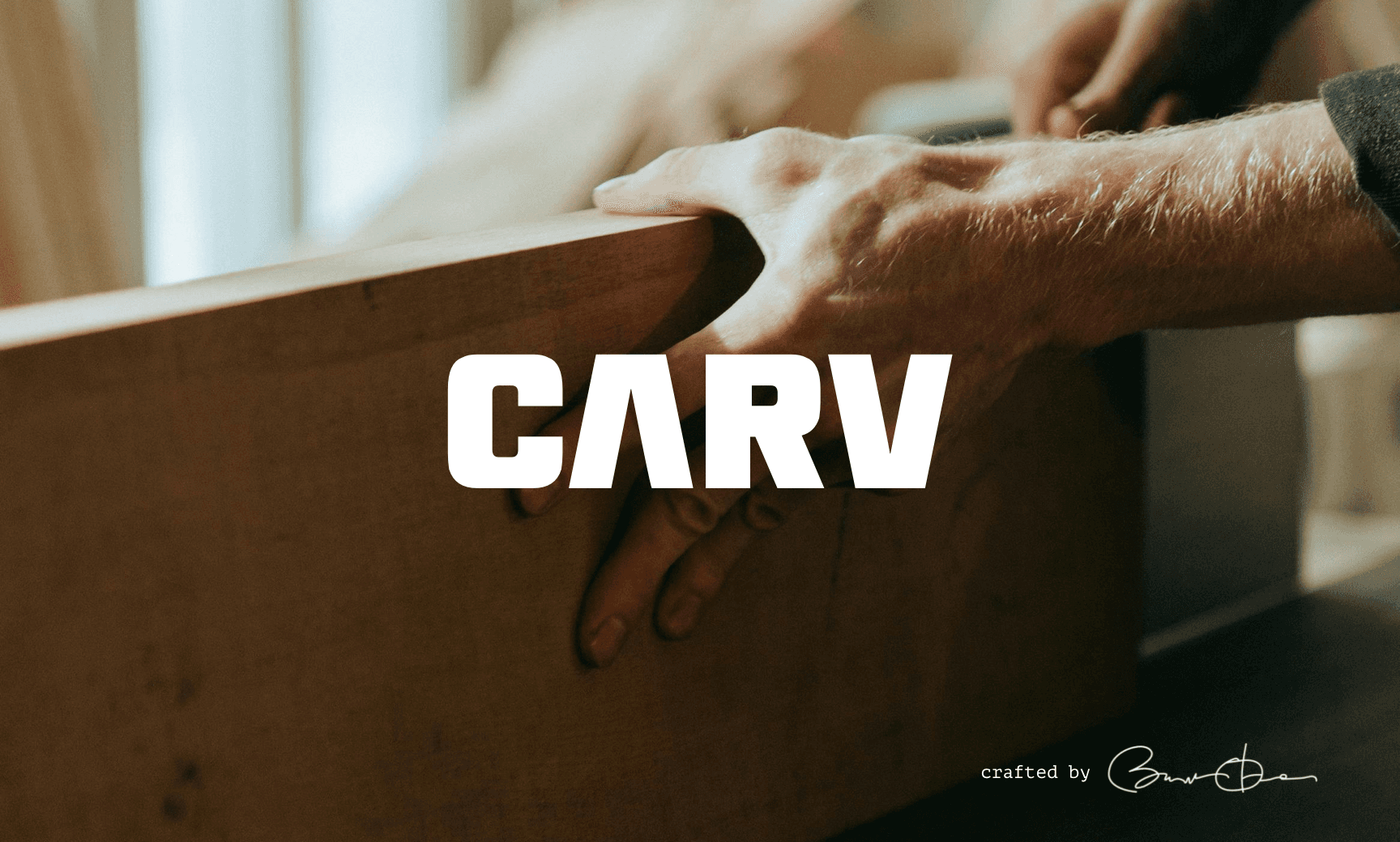
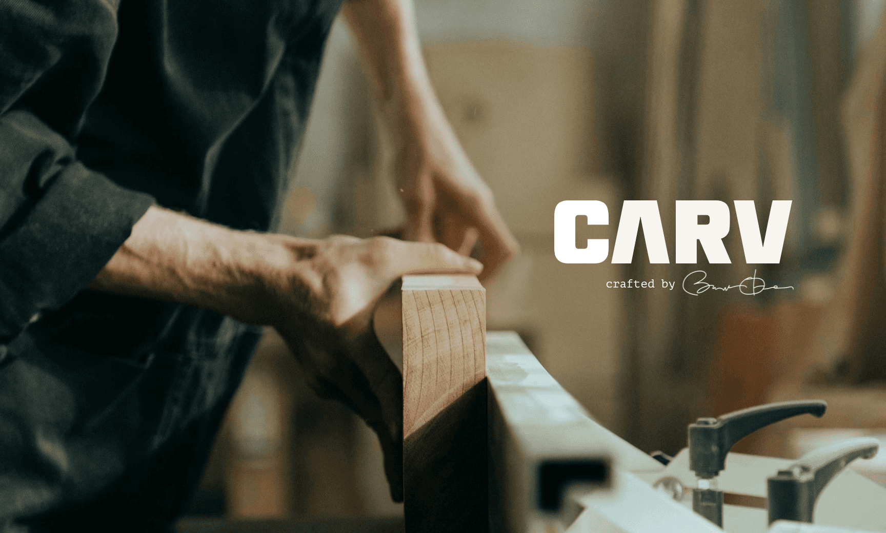
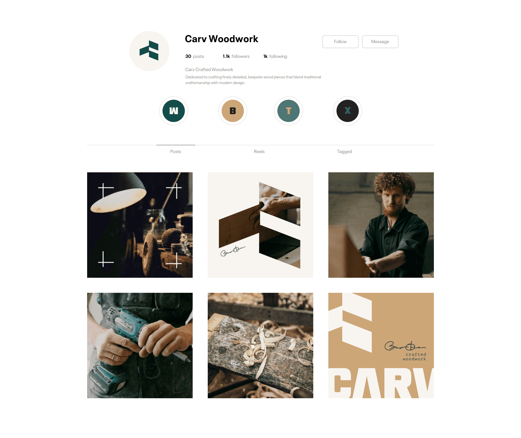
The Brand at a Glance
Carv is a modern woodworking brand that emphasizes precision, durability, and intentionality. The aesthetic is structured and minimal, reflecting the patience and clarity found in the craft of shaping raw material into enduring form.
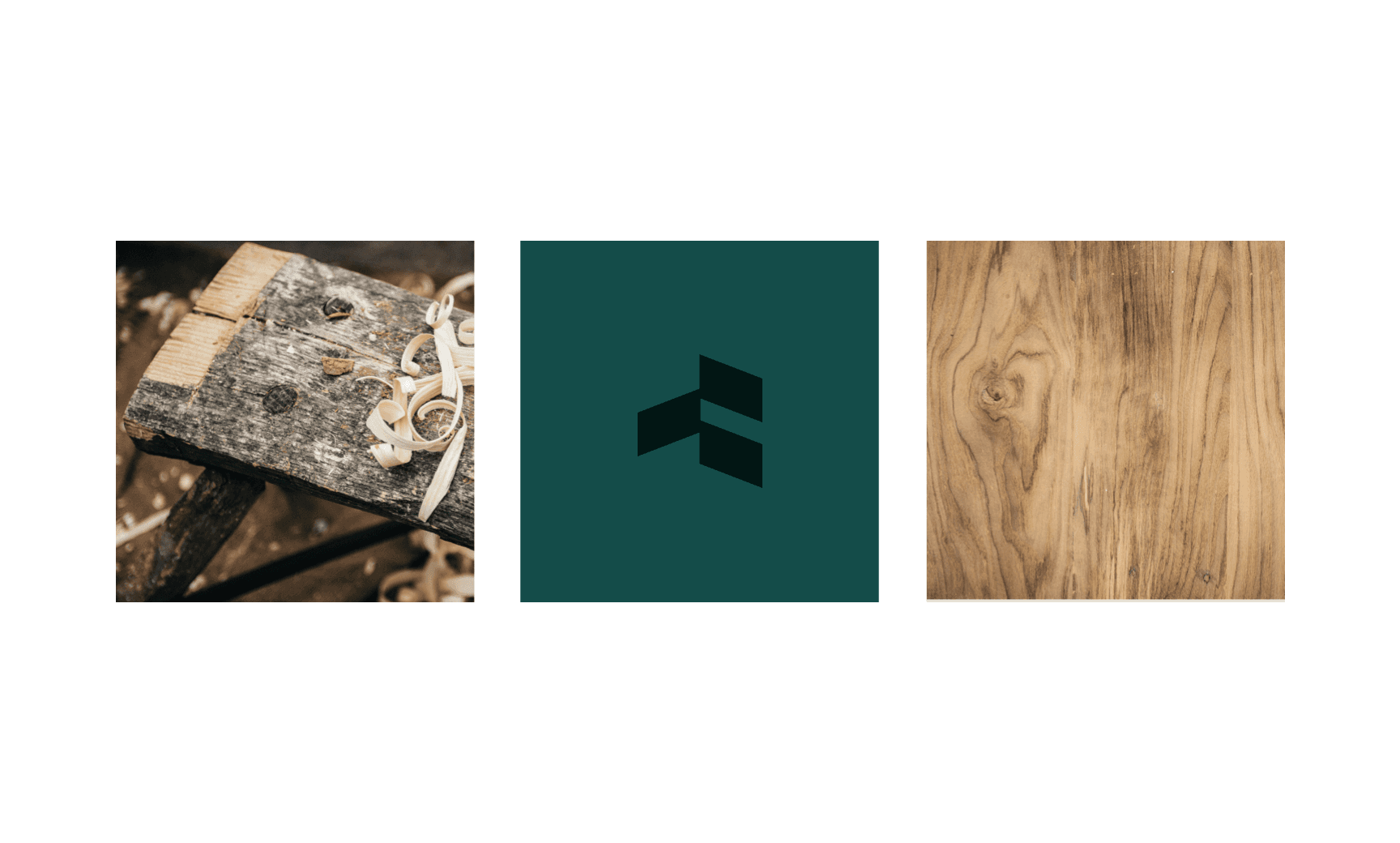
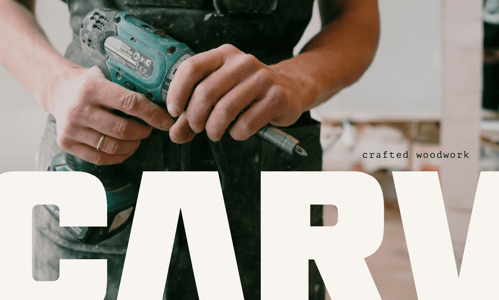

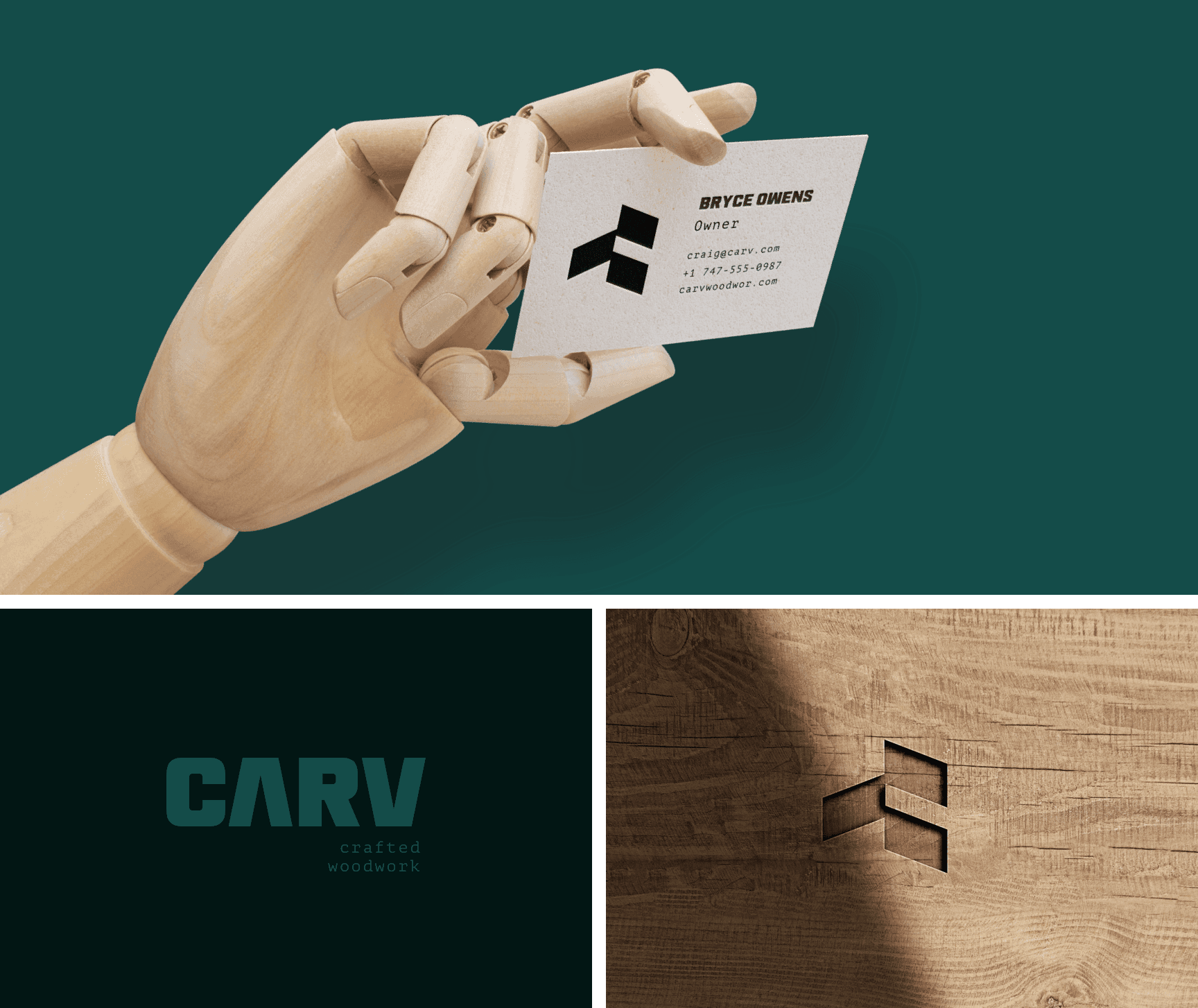
Strategy and Design
The strategy began with the insight that clarity itself was the value proposition. Carv doesn’t need decoration because its work speaks through precision. From that core, a design system was developed around architectural logic and physical elevation. The brand mark features stacked geometry, echoing modular wood joinery. A bold sans serif wordmark supports this structure by using solid forms with wide spacing, reinforcing ideas of patience, weight, and build quality. Colors and imagery highlight raw textures, fine tools, and hands in motion. Strategic anchors like grain, edge, and legacy served as creative guideposts. This approach resulted in a brand that shows confidence not through ornament, but through intention.
Click below to schedule a call.
GET STARTED