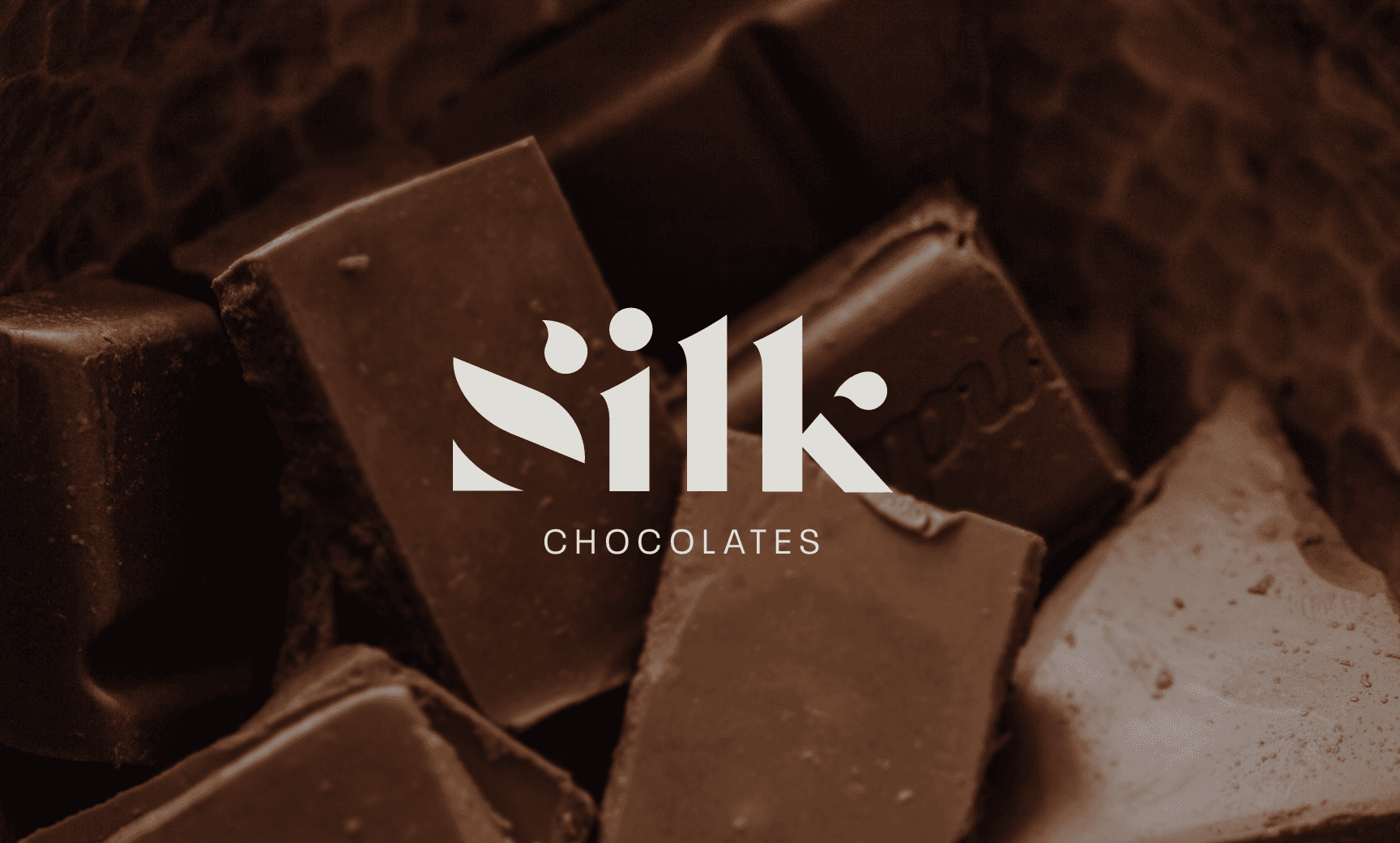
The Brand at a Glance
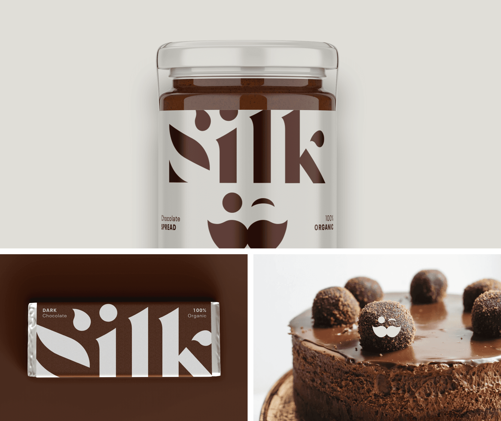
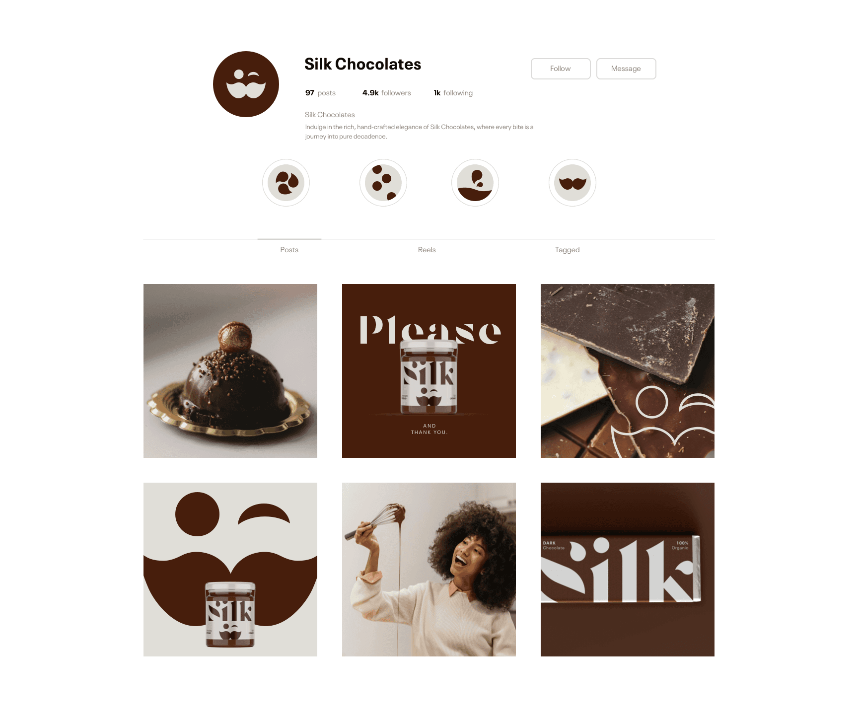
Silk is a chocolate brand designed around intimacy, indulgence, and texture. It explores the emotional quiet of taste and the luxury of slow moments. The brand needed to be elegant, but grounded in physical experience.
Strategy and Design
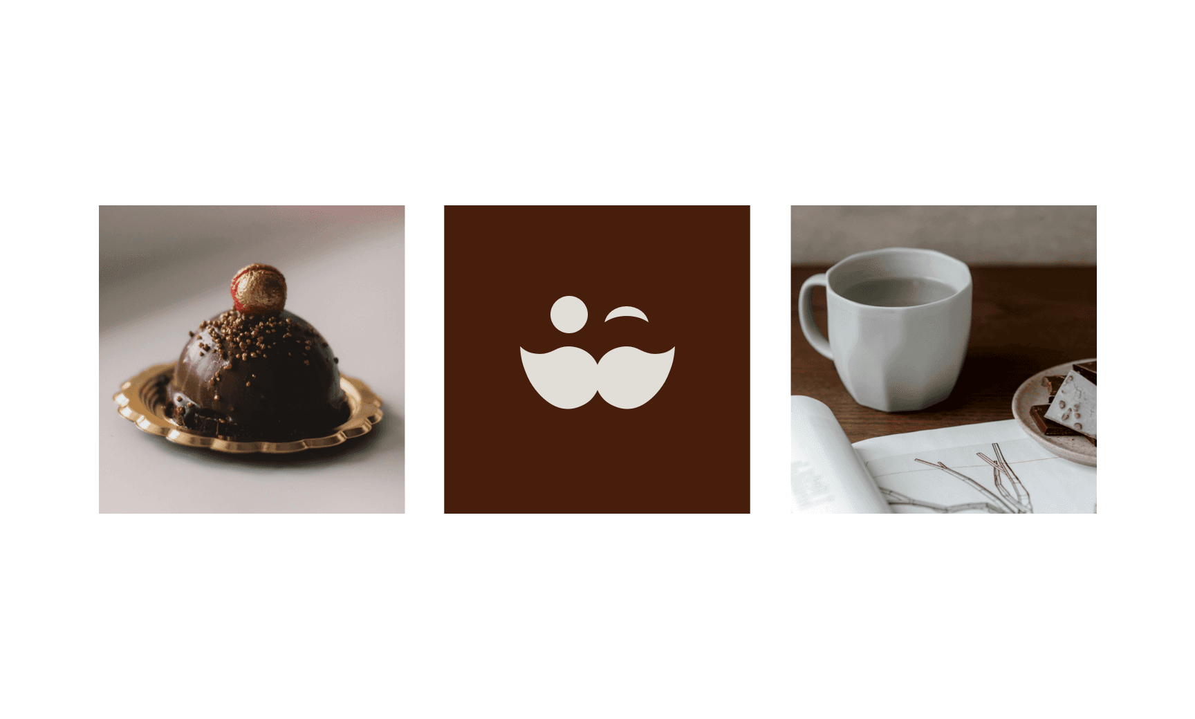
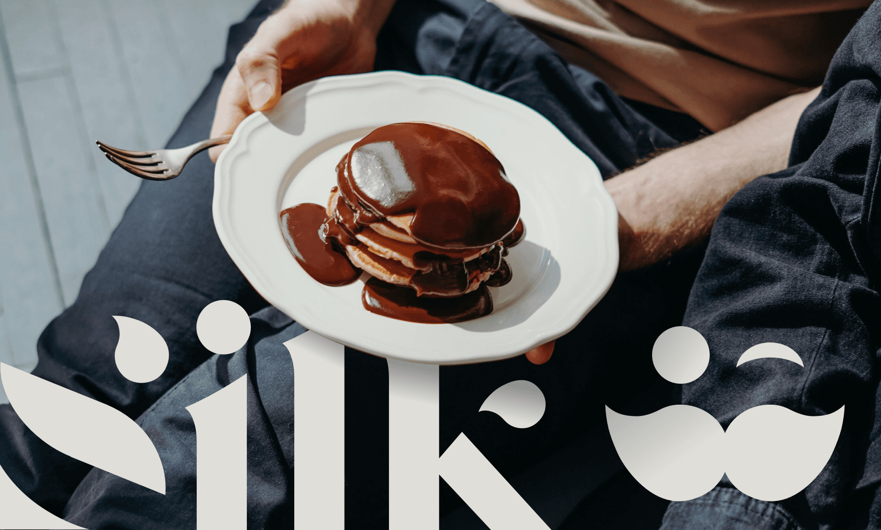
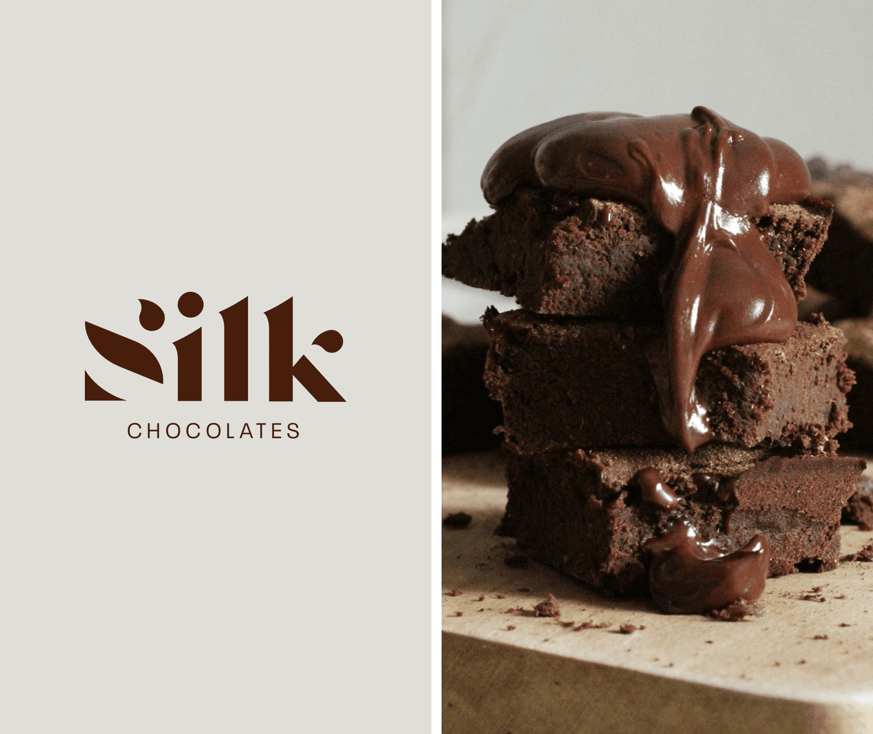
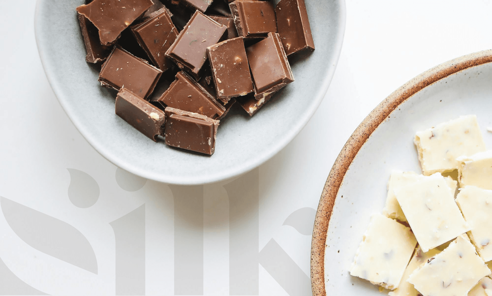
The name Silk provided a clear direction. Every element of the identity had to reflect the feeling of touch and flow. A custom wordmark with soft curves and careful spacing creates a sensation of motion and melt. Supporting symbols use negative space and shape repetition to suggest layering and smoothness. The color palette includes rich chocolate tones balanced with soft neutrals and accents that feel like packaging foil or dusk light. The system avoids heavy ornamentation, opting instead for subtle gestures that reward attention. Brand strategy terms like melt, hush, and gift shaped a visual tone that feels personal and quiet, offering chocolate as a moment to oneself rather than a reward to perform.
Unlock your
brand strategy
Click below to schedule a call.
GET STARTED