The Brand at a Glance
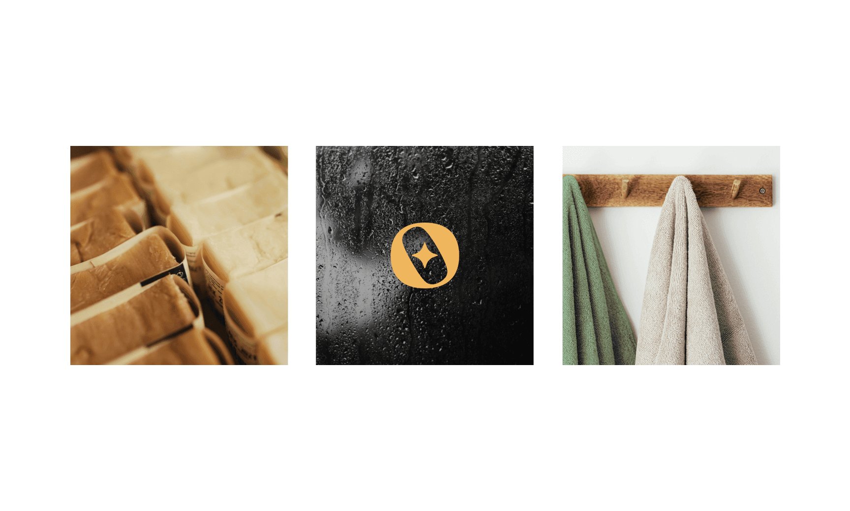
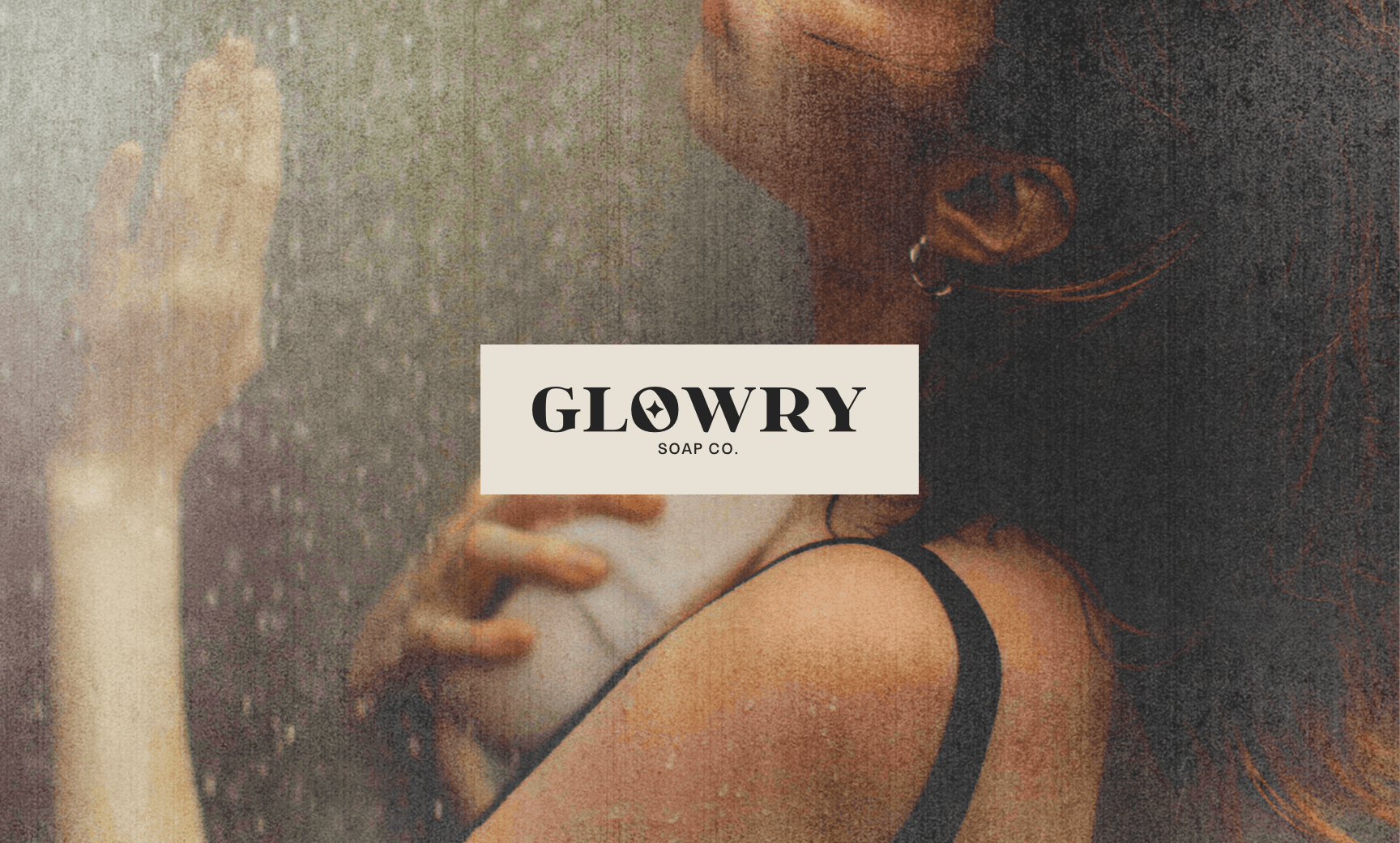
Glowry is a handcrafted soap brand that elevates self-care into a personal ritual. Its identity merges raw sensuality with calm refinement, built around themes of body awareness, nature, and intentional living. The brand exists in the space between bold and tender, aiming to reflect a sense of grounded confidence.
Strategy and Design
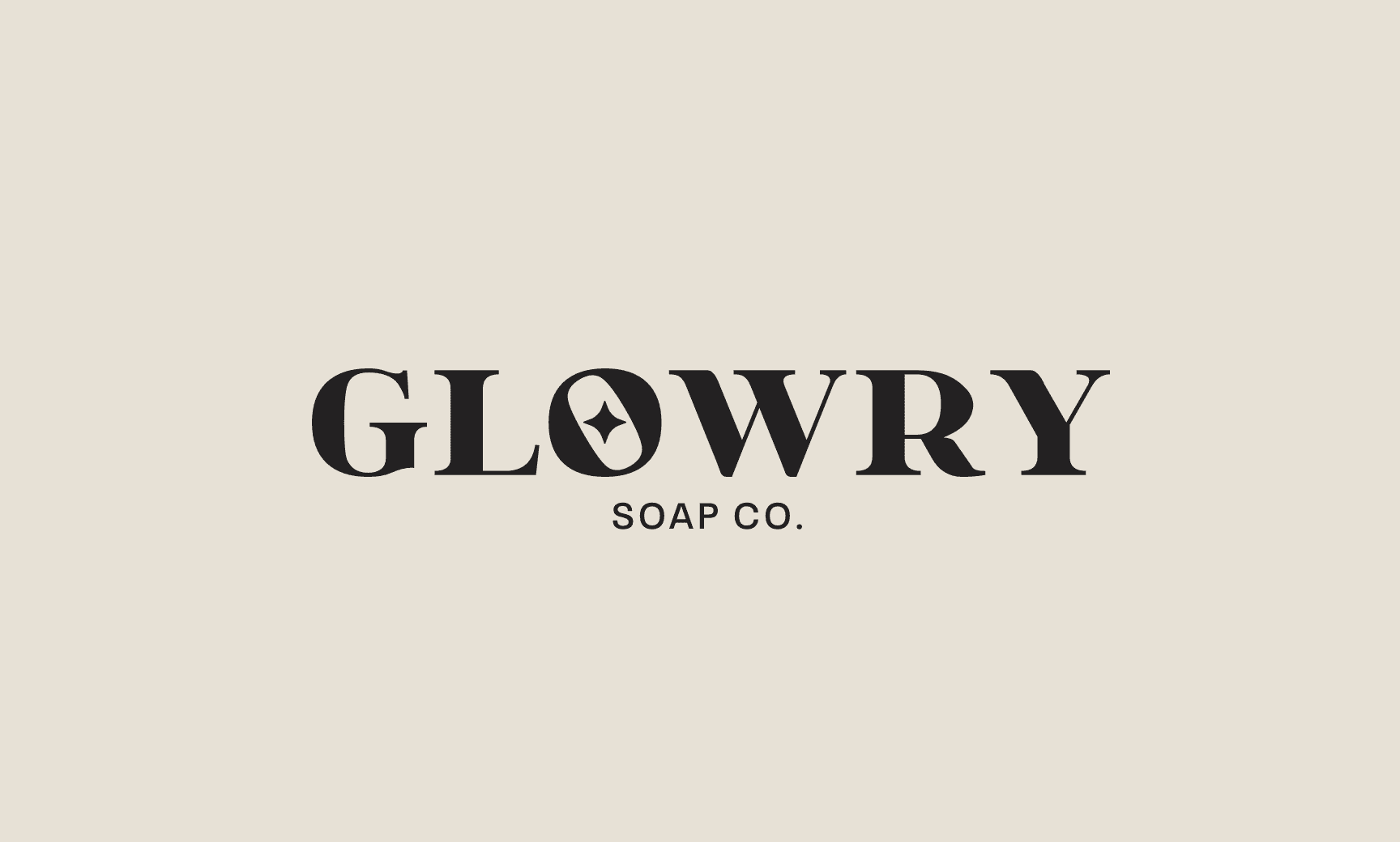
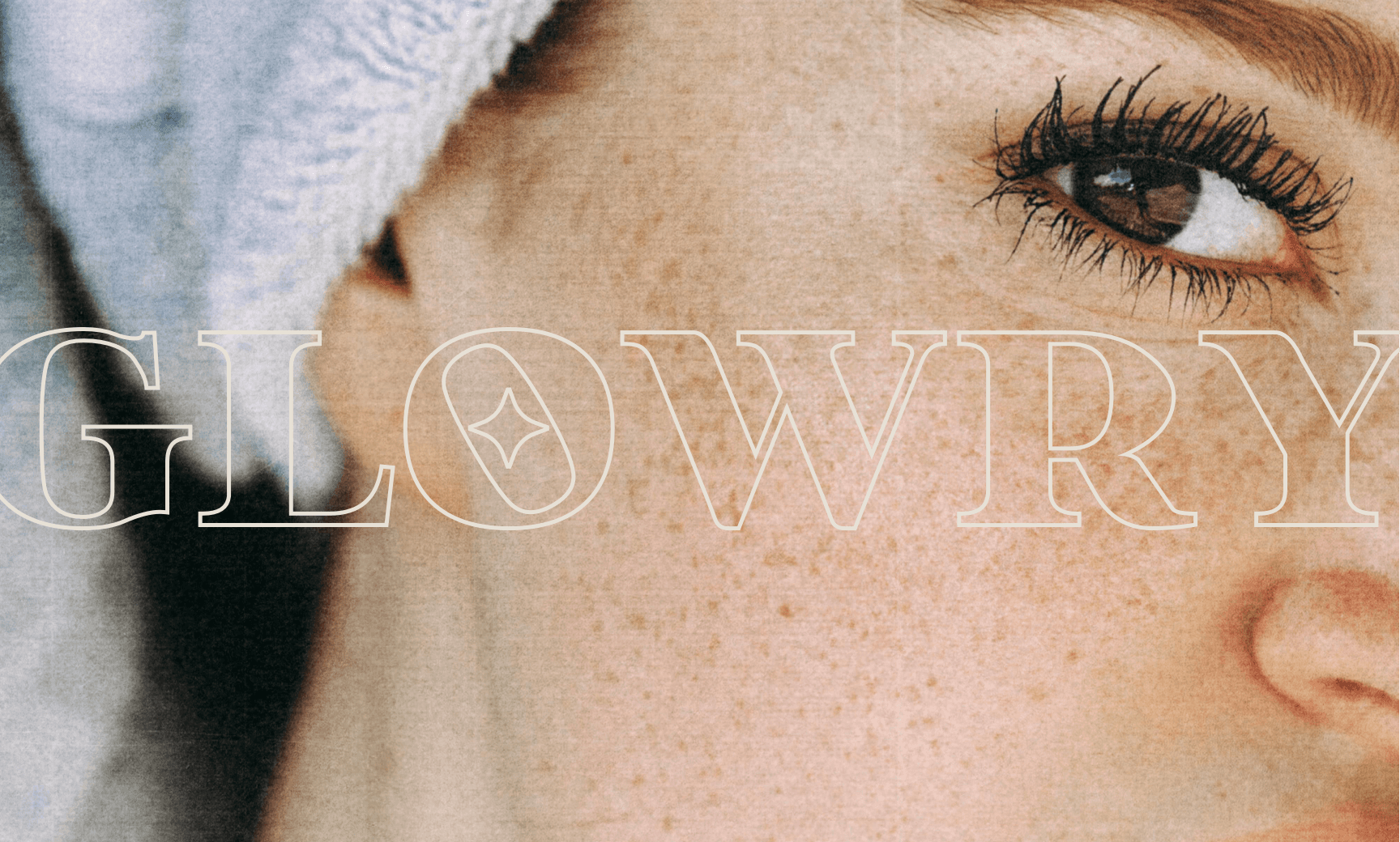
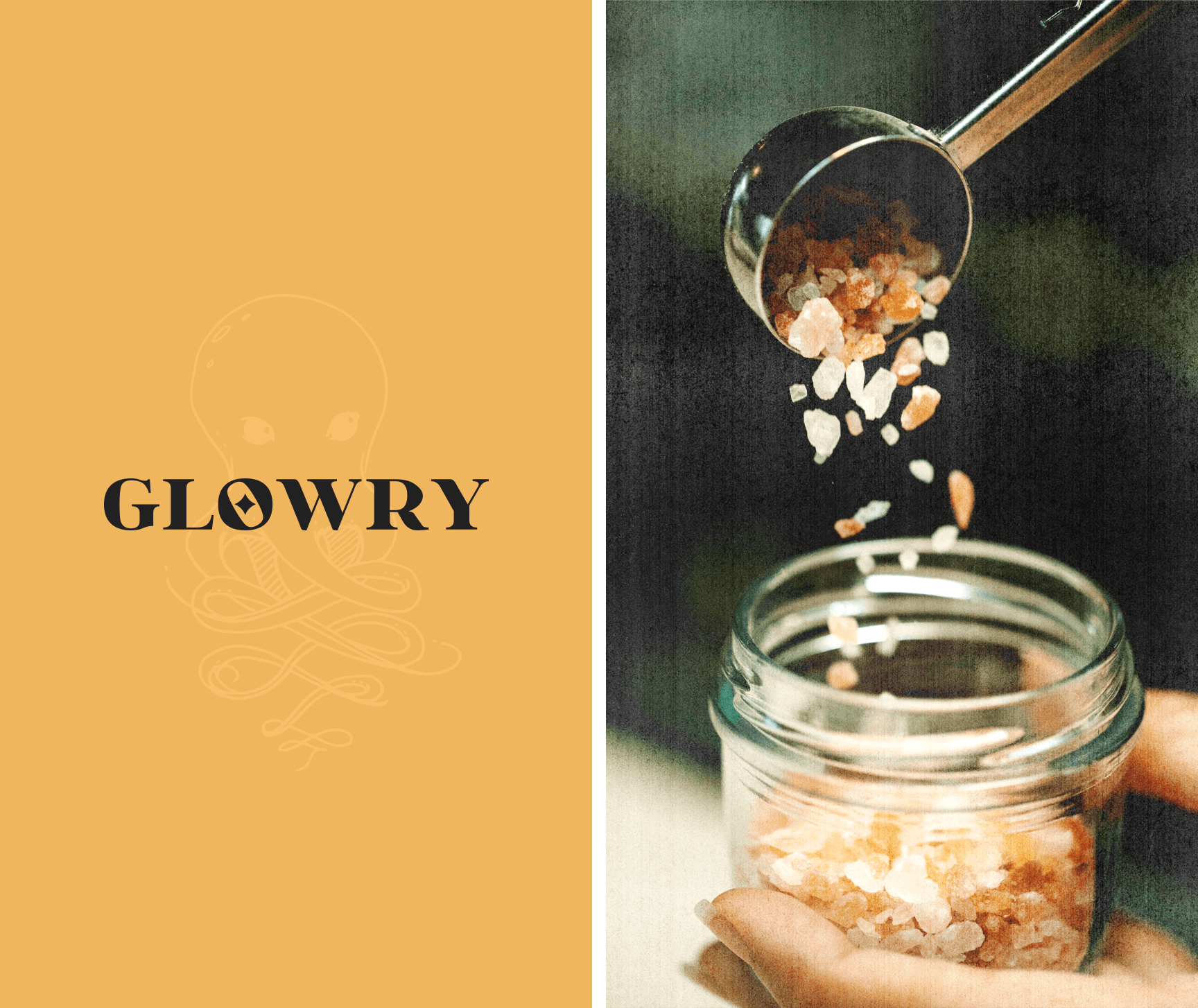
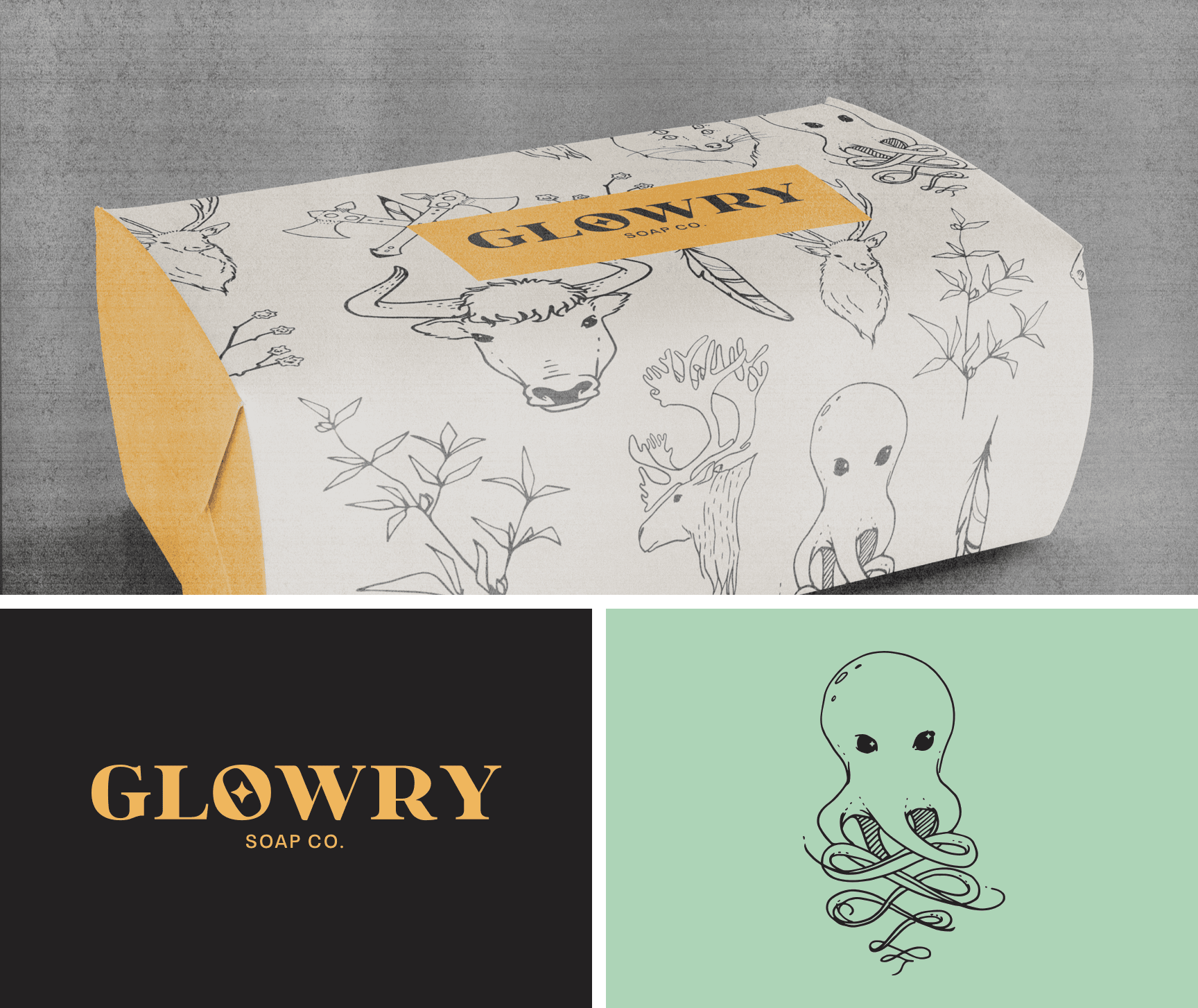
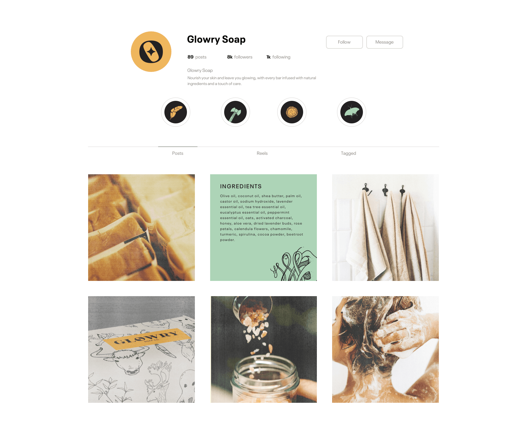
The strategy for Glowry began by identifying its core brand energy as feminine control. Not passive beauty or surface-level luxury, but something more visceral and owned. From that insight came the octopus emblem, a symbol of intuition, grace, and strength working in concert. The name Glowry itself holds a tension between glow and glory, light and weight. The visual identity amplifies that duality through a bold serif wordmark where the “O” becomes a central motif, suggesting both an opening and a watchful gaze. Supporting illustrations reinforce this narrative of softness with grit, showing skin and salt and messiness as part of the experience. Strategic keywords like ritual, pulse, and bloom shaped the entire creative system, resulting in a brand that communicates not just what it sells, but why it matters.
Click below to schedule a call.
GET STARTED