The Brand at a Glance
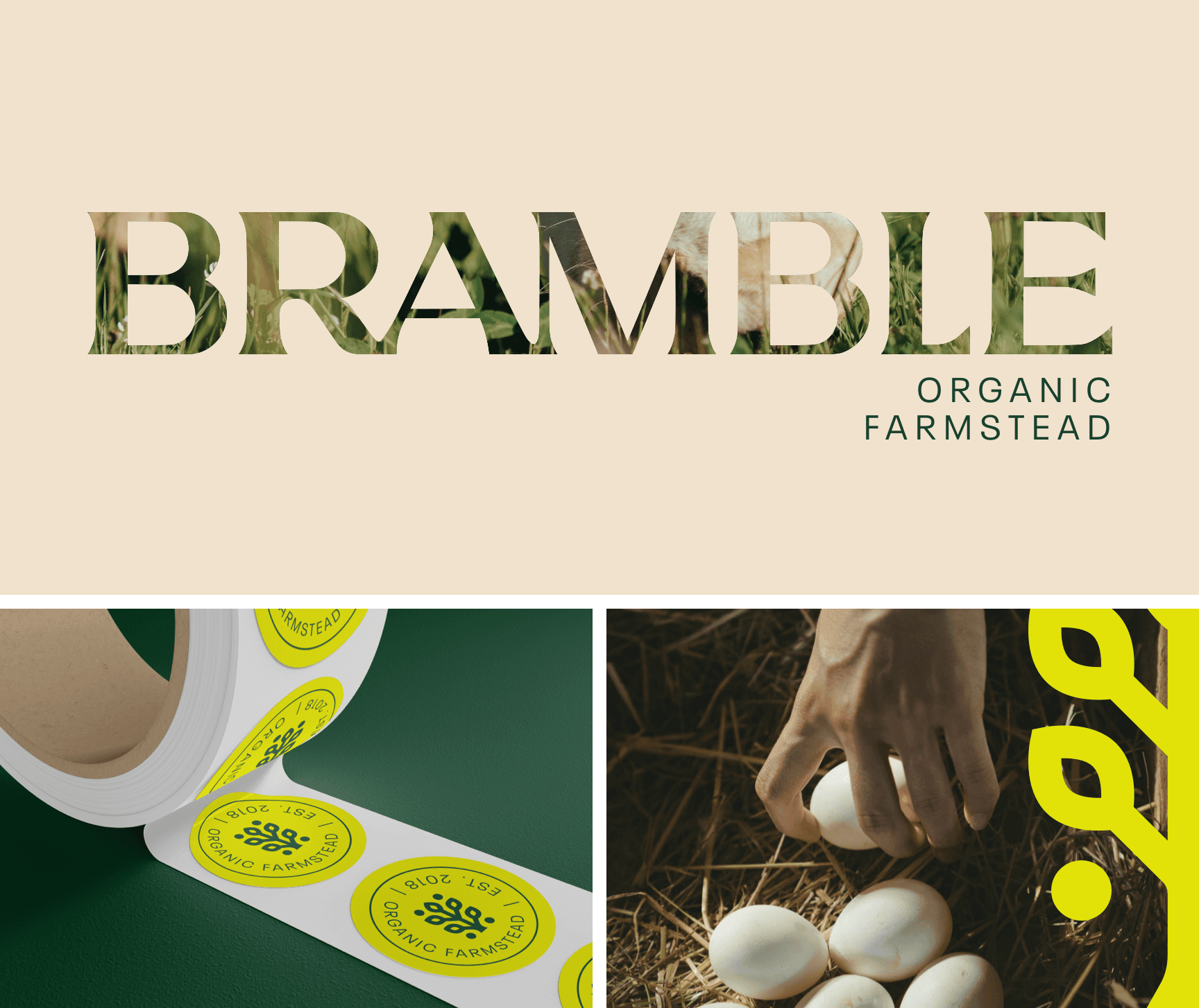
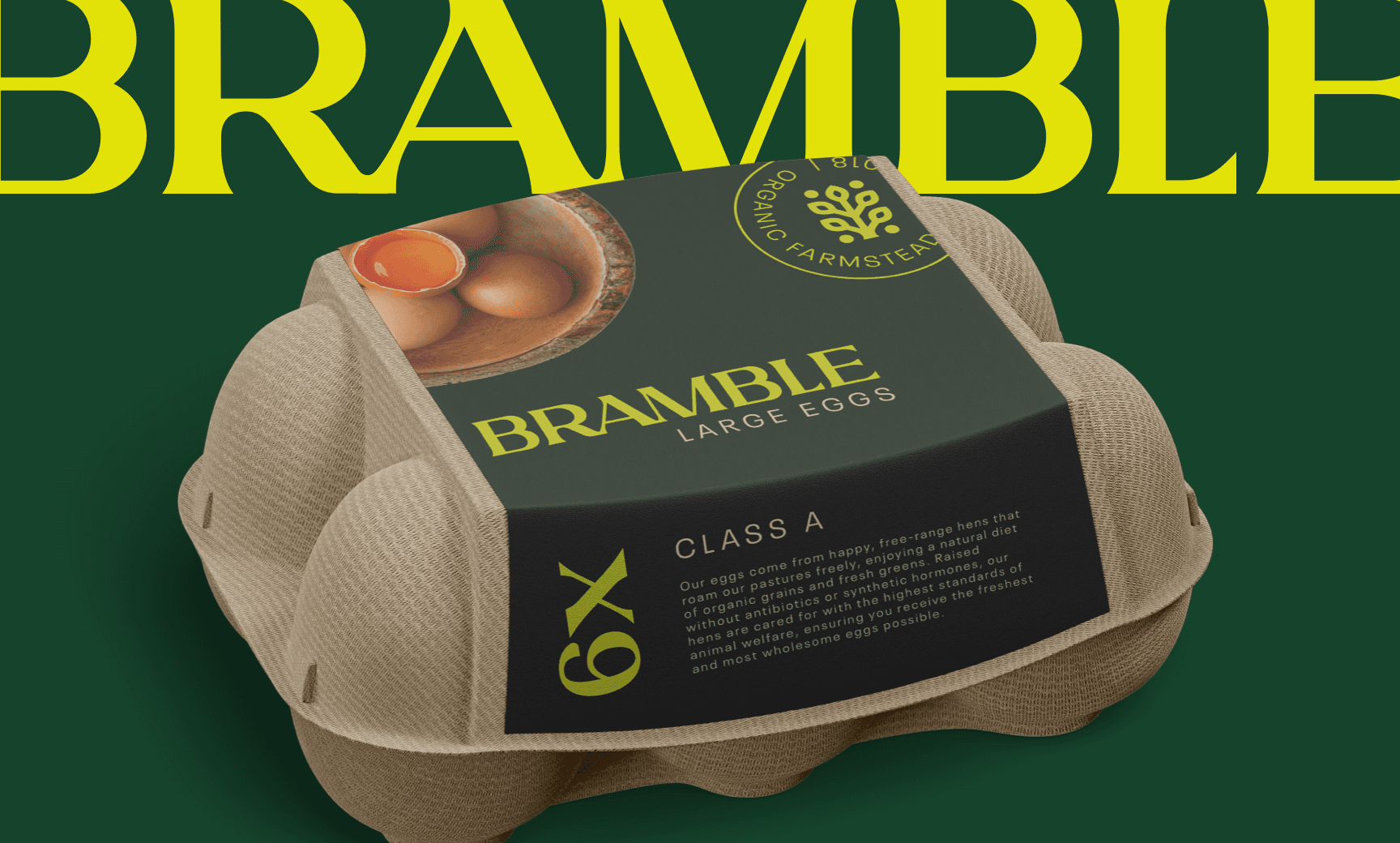
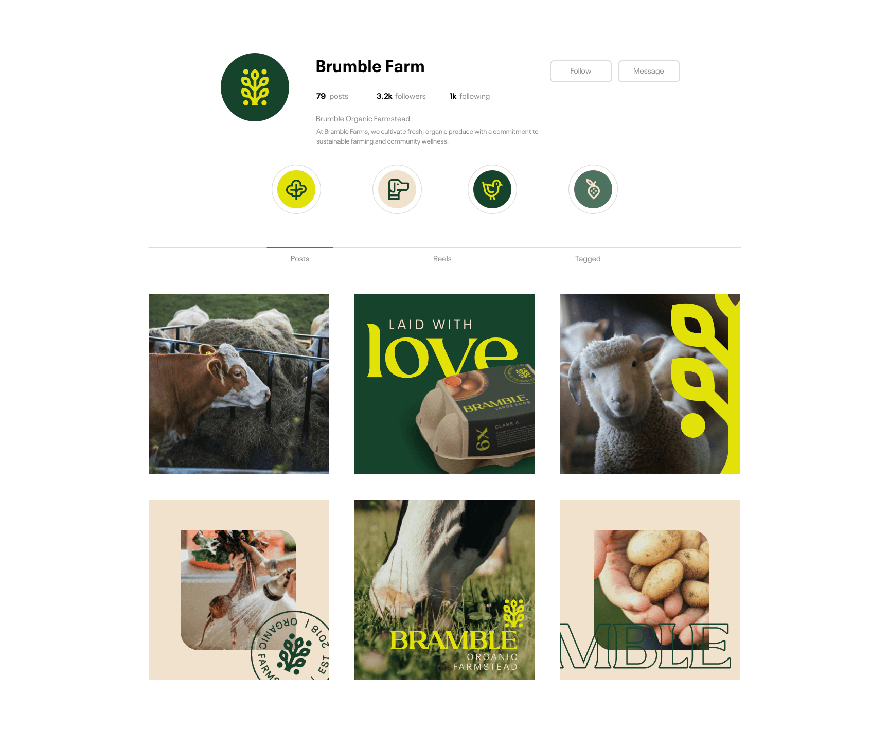
Bramble is an organic farmstead brand that reflects deep respect for land, tradition, and the rhythms of real agriculture. The goal was not just to look natural, but to express a worldview built around stewardship, resilience, and cycles of care.
Strategy and Design
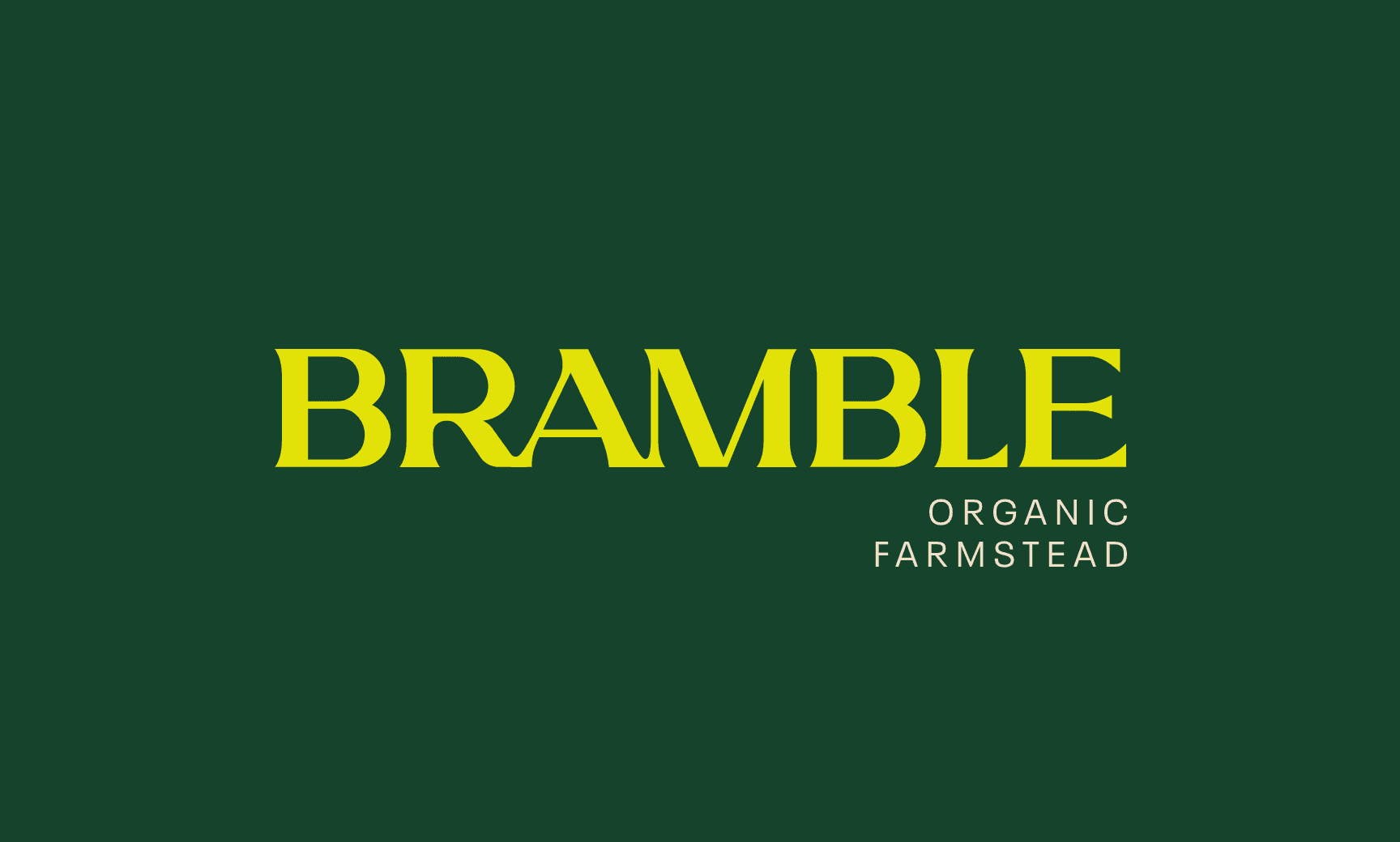
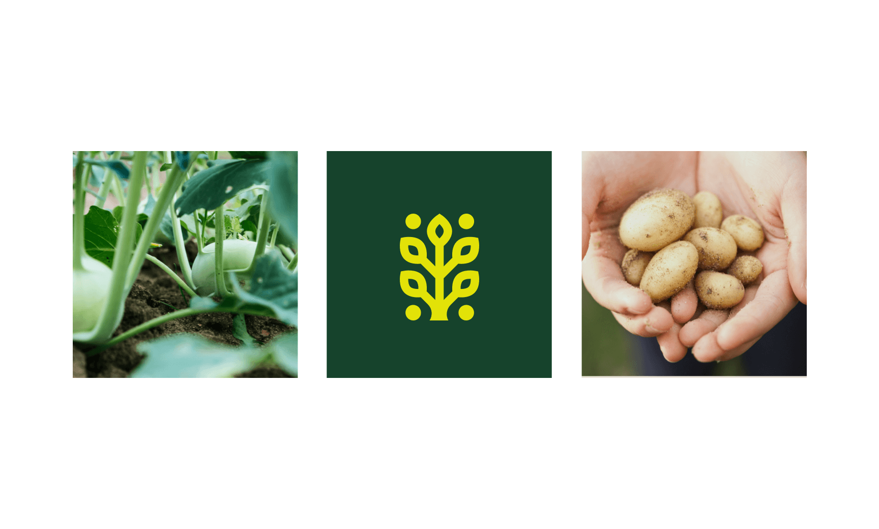
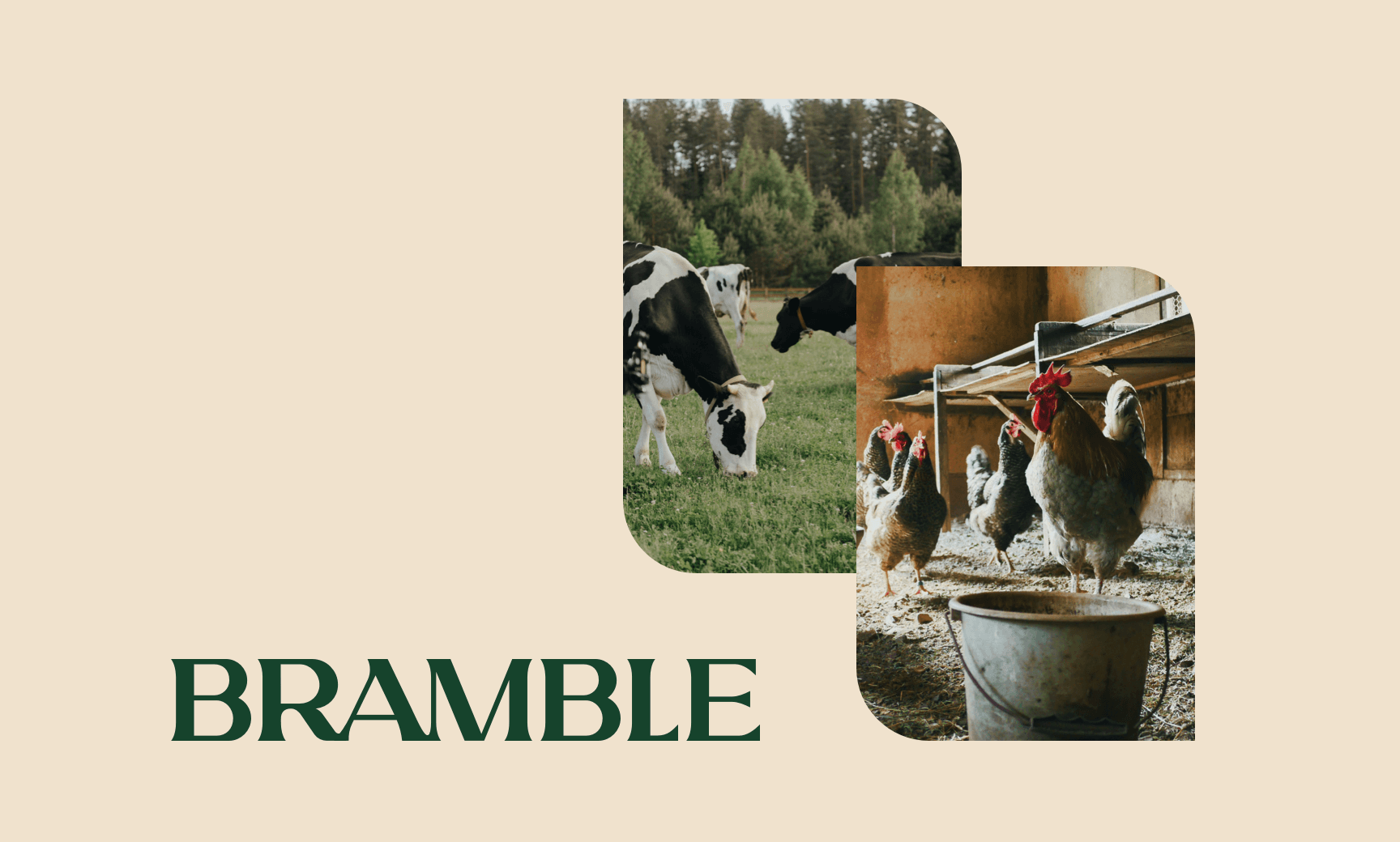
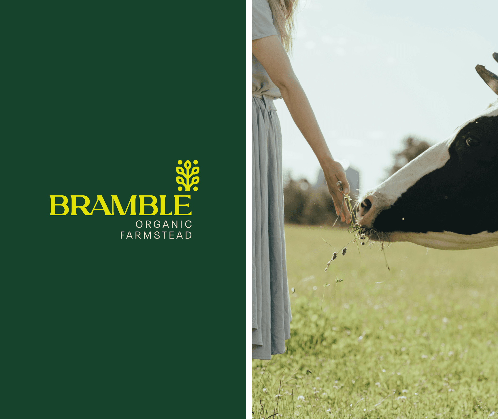
The strategic foundation began with the word Bramble, a name that conveys wildness and rootedness in equal measure. That tension guided the entire visual system. The brand mark uses a sturdy serif that feels timeless but not ornamental. Its sharp rhythm mirrors the structured yet organic nature of farming itself. A custom sprout icon was developed to represent both new growth and generational continuity. The yellow and green palette reflects actual photosynthetic process—sunlight and chlorophyll—rather than simply referencing the color of vegetables. Design choices were anchored in strategy terms like soil, kin, and harvest, giving the brand a calm confidence. Instead of leaning on rustic tropes, Bramble shows restraint, allowing its clarity and consistency to communicate integrity.
Click below to schedule a call.
GET STARTED